Skip to content
English
  • There are no suggestions because the search field is empty.

How do I navigate Activity Stream?

If you have not gotten a training session to our platform yet, or it has been a while since you used it, this article will introduce how to vavigate to dashboards and how to use the search function. 

What is Activity Stream?

Activity Stream is a real-time analytics platform that takes transactional data from your ticketing platform, combines it with data from other sources, and uses it to build a live, interactive dashboard that you can use to explore your data. For more information, check out Activity Stream’s website


Characteristics
Real-time - Depending on your ticketing platform our data refreshes between real-time and once per day.  

Dynamic - Almost everything you see on Activity Stream can be added as a filter. This helps you narrow down your view to create precise customer segments and view only that data you need. 


Adaptive - Every time you add a filter or exclude a value, the URL of the platform changes, so you can easily copy/paste the URL to your colleague and they can see what you saw. This means you can also bookmark various pages and see them with the same filters the day after.

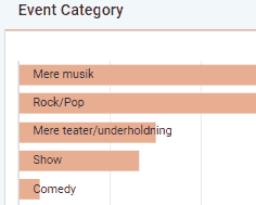
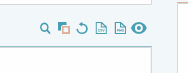
Level of detail - There are a lot of features on Activity Stream, a lot of them almost hidden at first sight (like the 6 buttons on every component which allow you to deselect specific elements, or download the graph).


You cannot break anything while looking into your data, so feel free to press every button and explore every dashboard. At the same time, when the time comes that you need to put together a very specific report and have no clue how to get there, send us an email with details and we will help you out!

Basics to get around
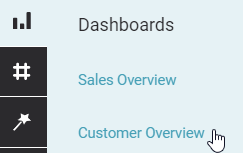
Dashboards

Depending on your organization's setup, you will have between 3-8 dashboards available to you (add-on dashboards include donations, products, etc. Some of these may not apply to you or be available via your ticketing platform). The available dashboards can be reached from the menu icons in the top right corner.


Top bar

Every dashboard features a search at the top of the screen as well as several dropdown menus that allow you to adapt the view. You can use the search to search for customers/events/productions and all come with their own specific view when clicked on.


You can use the other icons and dropdowns to: 
  • change the date range of the data that you are looking at (Calendar Icon)
  • Export a CSV of the audience or a PDF of the dashboard (Export)
  • The granularity of the graphs with date ranges (Stopwatch Icon)